

This is my Illuminated Letter Print project. First we got a piece of rubber, and carved our letter in a satisfying design. I carved my piece of rubber with great thought, and added the aztec tribal print inside my letter. Then, we get paint, and mix the colors in to a creative combination. I applied the paint to my piece of rubber, and pressed it onto a construction paper. I really enjoyed this fun project, and learned a lot at the same time.

This is my impressionism painting. I chose a landform, which is a beautiful sunset. I took this picture myself. I tried my best in the gradation from yellow,bright to dark, orange, only using the primary colors.

This is my East Asian teapot. I also made four teacups to match the pot. The idea/shape was given to me by researching about the Japanese tea tradition. The most well known tea in Japan is Green tea, and this is why I chose the colors red and dark blue. I thought that those two colors would look good when Green tea is being served. During this project, I had a lot of fun, but I also learned a lot of factual information throughout my research and experience.
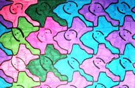
This is a colorful tessellation of an elephant. I tried to use a combination of warm colors and cold colors. (red/purple &light blue). There are two big ears with a face, and two black eyes. There is a long nose. I really like my shape. I also added a gradation effect to the two ears, so that I could elaborate the elephant's face.
This is my paper project. The materials I used were only white A4 paper, and some Elmer's glue. The concept of my project was simple. Although it looks simple, it does not mean that my work has no respect in it. My idea was to show the elegance, coordinating a story inside it at the same time. I showed a gravestone, with beautiful flowers on the top of it. I wanted to turn something gloomy, into a more of a graceful project, as it is shown.

This is my self portrait. I cut out half of my face, and drew the other half with a pencil. I liked this project, because it helped me to improve in working with the pencil. However, it was hard to control the colors and shades with the pencil.The most challenging part was drawing out my dimples, and drawing my eyes.
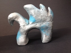
This is my Henry Moore sculpture. I worked hard on it, with all my effort and thought into it. I liked spray painting it, but it was challenging to carve the delicate sculpture. I started this project with a spongy material. I cut out a creature that represents a swan, with a knife. I deformed the swan in my sketch. After I cut the knife, I made it smooth with a brush. Then, I painted the material with paint in three layers. After the third coat dried, I spray painted it in silver and blue, to represent individuality and water.
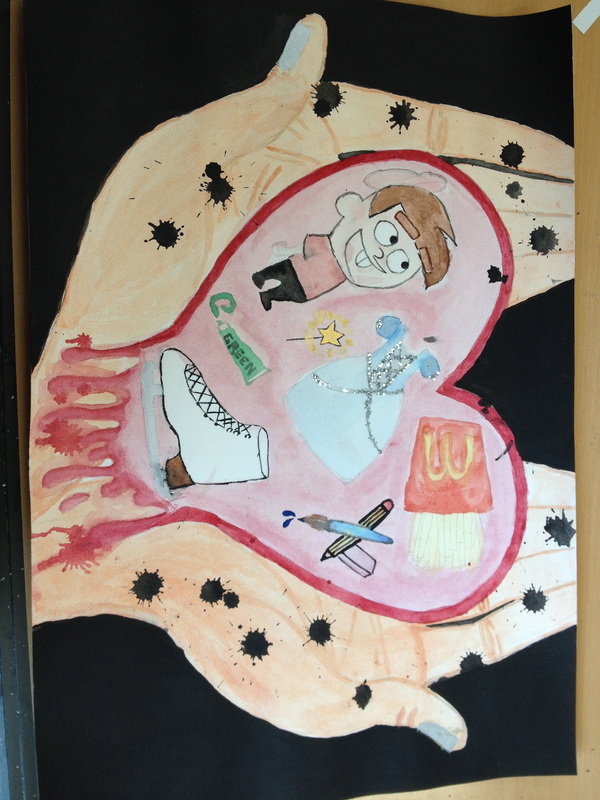
This is a picture that I painted, and it is about my childhood going away. I love my childhood since it makes me feel nostalgic, but now that I am a growing teenager, I have to give up with them in order to move on. Therefore, my favorite moments in my childhood are represented in the heart, and the heart is currently melting away, while we release black tears. The materials that I used were glitter, and water color paint. I had a lot of fun while painting this, thinking of great memories. However, it was hard for me to control the water color paint, since once the color was on the paper, it was impossible to make it vanish, or make it lighter.
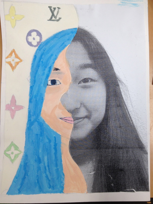
This is my half-self portrait #2, using paint instead of lead. I was inspired by a Japanese artist, named Murakami Takashi. He likes to sculpture animation figures, and his trademark is a smiling flower, and cute skulls. He also did a collaboration with Louis Vuitton, so he changed Louis Vuitton's brownish hazel coloured logo, into a rainbow logo with a white background. Therefore, I added his Louis Vuitton design as my background, and I changed my hair colour to blue, because most of his animation sculptures had blue hair. I added strokes of different blues, to show a pop-out figure. Although it was a hard project, since it was harder that the sketch portrait, I enjoyed painting this, because it gave me a lot of freedom, while I learned about a painter at the same time.
